


ASU Global Launch - Website Redesign

role.
UX Designer and Developer
timeline.
April 2024 - Current
tools.
Figma, Drupal, Adobe XD
problem statement.
Redesigned key web pages for ASU Global Launch, focusing on usability, accessibility, and brand consistency. Enhancements in structure, visual appeal, and navigation supported a diverse user base, including international students and non-native English speakers.
design framework - double diamond.

discover.
Research and Analysis:
Conducted user research and reviewed feedback, identifying major pain points such as design inconsistency, accessibility barriers, and limited mobile optimization. Competitor analysis provided insights on successful design approaches used in similar educational websites.
define.
Implementation:
Using Figma, Adobe XD, and Drupal, I applied these changes, iterating based on stakeholder feedback to finalize a user-friendly, accessible design that met project objectives.
develop.
Prototyping and Design Solutions -
-
Design Enhancements: Added hero images, icons, and graphics for visual engagement, optimized pages for mobile, and aligned all visuals with ASU branding.
-
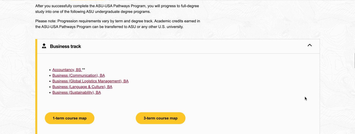
Simplified Navigation: Used accordions to organize content in FAQs and course options, reducing cognitive load and visual clutter.
-
Accessibility Improvements: Adjusted typography to sentence case, added descriptive alt text, and increased contrast with high-visibility icons for an inclusive experience.
deliver.
Implementation:
Using Figma, Adobe XD, and Drupal, my team and I applied these changes, iterating based on stakeholder feedback to finalize a user-friendly, accessible design that met project objectives.
design updates.
task 01/03.
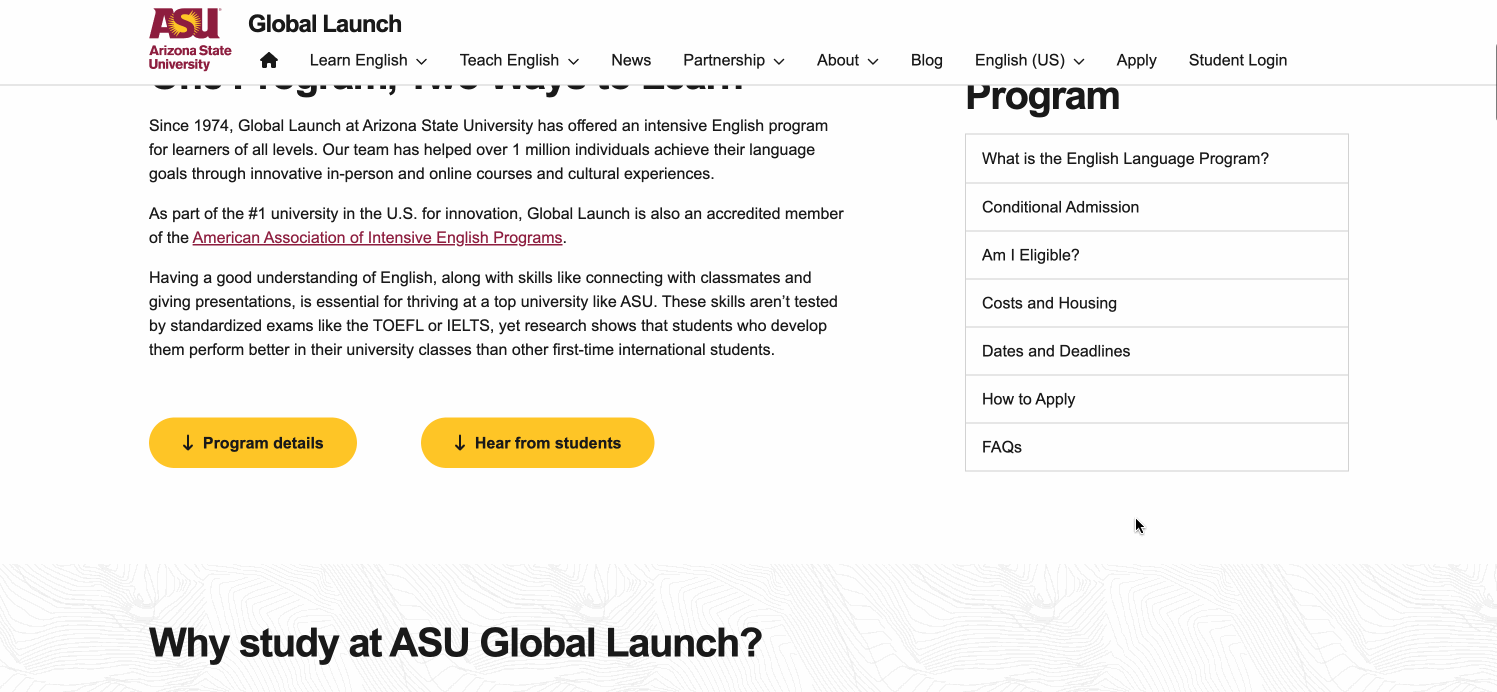
English Language Program Redesign
Added hero images and graphics for engagement, aligned visuals with ASU branding, enhanced navigation, and added a dedicated section to boost test visibility.
task 02/03.
English for Admission and Achievement Redesign
Incorporated icons and graphics, applied consistent branding, and ensured mobile optimization to provide a seamless user experience across devices.

FAQs and Course Options Reorganization
task 03/03.
Introduced accordion components instead of blocks of text and unorganised data, allowing users to expand relevant sections and reducing cognitive load.
work in progress.
1
navigation menu.
As per the heuristic analysis and usability test results, the navigation menu was overwhelming and confusing for the users. Therefore, a new navigation menu is in progress which is simple and user-friendly.
2
accessibility fixes.
There are certain elements of the website which are inaccessible, like:
-
Tabs are not keyboard friendly.
-
All uppercase text.
-
Images have missing alt text.
3
admissions page.
Conditional admissions page is text-heavy and has tabbed content which is inaccessible and difficult to read.
outcomes.
-
Created an inclusive, accessible user experience aligned with web accessibility best practices.
-
Reduced cognitive load and streamlined information access, improving navigation efficiency.
-
Enhanced visual engagement and ensured consistency with ASU’s branding across devices.


