


Requirements Management Tool
A next-generation cloud-based platform for transparent and collaborative Car Infotainment UI Development.
Role
UX Designer & Developer
Timeline
2 months
Client
THE PROBLEM
At BOSCH, designing UI for car infotainment systems wasn't the hard part, aligning teams around those designs was. Developers were guessing requirements, designers were repeating themselves in email threads, and stakeholders were left asking, “Wait, where are we on this?”
The existing process was broken: handoffs were messy, documentation was scattered, and miscommunication bloated timelines. We needed one truth, one space, and one flow.
THE MISSION
Create a centralized requirements management tool where engineers, designers, and developers could collaborate in real-time and where stakeholders could actually see progress before the final demo.

Proposed solution UI - A Dashboard with HMI Screen on left and screen specific requirements on right with their current status.
APPROACH
Rather than designing in a vacuum, I grounded everything in Jobs-To-Be-Done and sprint-based Lean UX.
JTBD + Lean UX in Action
Why do users need the Tool? - JTBD Highlights

Requirement Engineer
"I want to write element-specific requirements fast and avoid repeated clarification."

UX/UI Designer
"I want to hand off designs without manually explaining every pixel shift."

Developer
“I want latest specs + designs in one view—no scavenger hunts.”

Manager
“I want live project status and clear ownership, not a Slack guessing game.”

Stakeholder
“I want visibility. Early. Often. Organized.”
Web App Workflow - Ideation

User Journey Map: From login to complete Requirement Specifications document download

Each Requirement should contain these details

Requirement list View - Structure
Wireframes - First iteration

Wireframe 1 & 2 : List of Projects > Each Project Overview Screen

Wireframe 3 & 4 : List of Screens & HMI Requirements in SRS format

Wireframe 5 : Screen Requirements View - Left side is the HMI screen, right side is the screen specific requirements
INTERACTION & PROTOTYPE - MVP
Built the tool with initial plan to check the usability and technical feasibility of the product and see how it could actually help its users the best!

Initial Screen after login for all users
Each project tab contains project specific content, screens, requirements, download SRS option and all other details.
Project Tab when clicked takes you to Project Overview. Where the team can see overall status and project details.

All the project screens uploaded from Figma
All the HMI requirements of the project - List view


Screen specific requirements view

Add generic/ project requirements from the list view.


Adding Element specific requirements for the screen.
Select the element, click on the "Add Requirement" .
HIGH-FIDELITY DESIGN & ITERATIONS

Sortable Tree View - Built the first high-fidelity design of Requirement List view.
What worked?
✓ Requirement Card Layout
✓ Expandable Requirement tree view for list
✓ "Add Section" Button
✓ Search Bar for requirement search
What didn't work?
✘ Requirement Status was not evident.
✘ Edit/Delete requirement - not accessible.
✘ Search filters missing.
✘ Visual appeal.

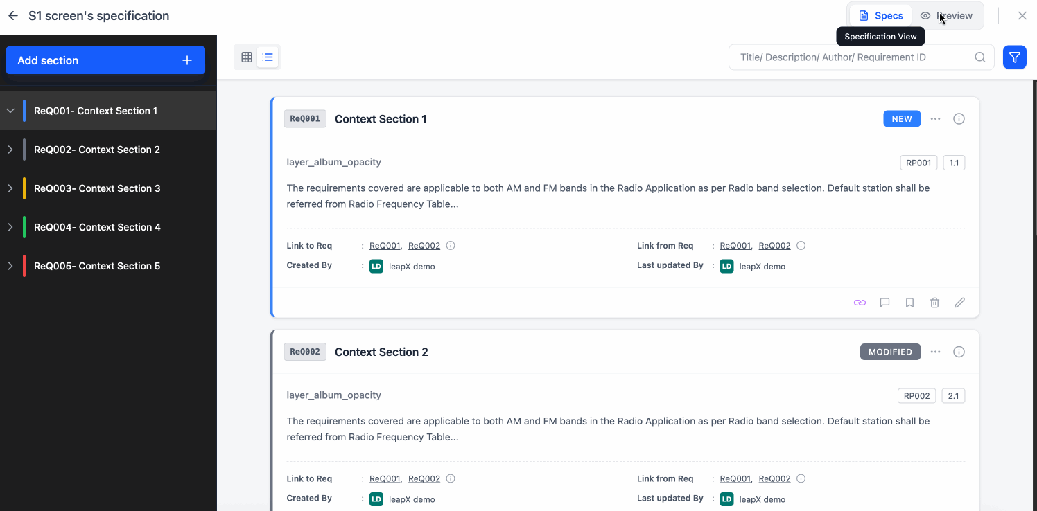
Refined Visual Design - High-fidelity design for the requirement list

Added a status colored bar near each requirement title for better indication of requirement status.

WHAT DID WE ACHIEVE? - RESULTS
40% ↓
in design-to-dev handoff issues
2 Sprints
saved per release through clearer communication
Automated
SRS Document Generation